


How to use Adobe Lightroom's Colour Grading tool
Do you want to create a dramatic effect in your images? Are you looking for more precise colour control in the bright, dark, and mid tone areas of your work? Well you are in the right place!
The Colour Grading Tool (I’ll call it the CGT from here on in) is a new addition to Adobe Lightroom, and to use it you’ll need the latest version of LR 2020. To put it simply, the CGT is a much more advanced version of the Split Toning tool as found in earlier versions of Lightroom. The new tool brings with it additional functionality such as a Midtone section, Blending sliders, Global adjustments, Luminance, and Colour Wheels.
If you’re still wondering what all this is about, think of it this way - you can use the CGT to precisely control colours or add creative effects to your images, and it allows you to give your images much greater tonal separation which will make them more dynamic and interesting.
Since its release, I have been using the CGT in my nature and landscape images to create beautiful and surreal effects, and the best part is that no matter if you are a travel, wildlife, landscape, product, or portrait photographer, you can use the CGT to improve your work.
So let’s dive right in.
What is Colour Grading in Adobe Lightroom?
Colour Grading is the process of colouring the tone of highlight, midtone, and shadow areas within an image independently. For example, you could tint the shadows, tint the highlights, or tint the midtones, or just tint one or two. And, with the CGT, you can also now control blending and balance while you’re at it.
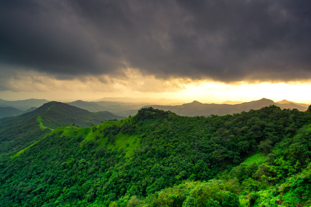
Let’s look at an example. This is an image of the Sahyadri mountain ranges on India’s West coast during the Monsoon season. While driving down the mountains, I came across this scene, which was rapidly changing. The monsoon clouds were approaching the mountain quickly and over the horizon the sun was starting to pierce through the cloud. It was a surreal landscape.
When I brought this image onto my computer, I applied basic adjustments in Adobe Lightroom. However, I wanted to emphasise the warm colour of the sunlight, while at the same time, I also wanted to showcase the cool and calm green colour of the forest. A global adjustment wouldn’t work here as these tones are just about polar opposites of one another.
The solution was to use the CGT to add yellow-orange colours in the highlights. In the shadow areas (the forest/mountain and clouds) I added a slightly cool colour. The result is an image with greater tonal separation.
1) The sliders
Let’s have a look at the sliders. In the CGT there are three sections under Colour Grading: Highlights (for adjustments to bright parts of the image), Shadows (for adjustments to dark parts) and Midtones (everything else). Each of these has its own Hue, Saturation and Luminance slider. In addition, there is also a Blending and Balance slider. At the top, next to the word ‘Adjust’, you can choose a variety of different views, including looking at all three colour wheels at once, or just one at a time. You’ll also find an option to make a global adjustment here.

Highlights
Let’s start with the Highlights slider. As mentioned, there are three sliders here - Hue, Saturation, and Luminance.
First, use the Hue slider to select the colour which you want to apply. Then, use the Hue Slider to adjust how the specific colour is applied to the highlights. With the Hue slider, you can select the colour to apply to the highlights. Saturation sliders will help you to control the brightness and effect of the colour.
Inside the circle, drag the saturation slider towards the right to increase the intensity of the colour you add in the highlights. To reduce the saturation, drag the slider towards the left.
Similarly, you can control the Luminance (the relative brightness of a colour) in the highlights. Drag the slider towards the right to increase the Luminance or drag the Luminance slider towards the left to reduce the Luminance.
Also, note that you can use the Luminance slider to tone up or tone down the Highlights. The effect of Luminance will be subtle. If you want to see the before and after of any adjustments you make, you can click the ‘eye’ icon on the right.
Shadows

Just like the Highlights section, there are three sliders here - Hue, Saturation, and Luminance.
The Hue slider adds a specific colour to the shadow areas, and the Saturation slider increases or decreases the intensity of that colour.
Use a Luminance slider to control the Luminance of the colour in the Shadow area. You can use the Luminance slider only to tone up or down the Shadow area as well.
Midtones

Midtone control is a new feature when compared to Split Toning in earlier versions of Lightroom.
When you select the Midtones area, you can adjust the colours in the Midtones area by using the Hue slider. Also, you can increase or decrease the intensity of the colour in the Midtones area by adjusting the Saturation slider.
To adjust the tonality in the Midtones area, use the Luminance slider.
In summary, all the sliders under the Highlights, Midtones, and Shadow area work in a similar way. However, one set of sliders affects Highlights, and the other sets of sliders affect the Midtones and Shadows.
2) Balance and blending
There are two interesting sliders under the colour Grading Tool - Balance and Blending. Let's look at how these work.
Balance Slider

The balance slider helps you to define the threshold for Highlights and Shadows by telling Lightroom what part to emphasise. For example, you could emphasise the shadow areas or the highlights, or have each emphasised equally. By default, the Balance slider is set to 0.
If you drag the Balance slider towards the right, then most of the image area is treated as Highlights. Similarly, dragging the Balance slider towards the left treats the image area as Shadows.
Blending Slider
The blending slider determines the transition between three tonalities - Highlights, Shadows, and Midtones. Blending sliders will control how these three tonalities transition or overlap with each other.
By default, the Blending slider is set to 50. This is also a good starting point for the Slider.
If you move the Blending slider towards the left (near to zero), the transitions between the three tonalities will be quite strong. Similarly, if you move the Blending slider towards the right (near to 100), the changes between tonalities will be subtle.
Each image and light conditions are unique, so I recommend experimenting with your images for both Balance and Blending.
3) Global Adjustment

In addition to Highlights, Shadows, and Midtones, there is a Global Adjustment tool. It’s one you may not use much (as hopefully you now understand how to make finite adjustments to your images), but it can be useful in certain circumstances if you want to make a subtle, creative effect on all parts of an image.
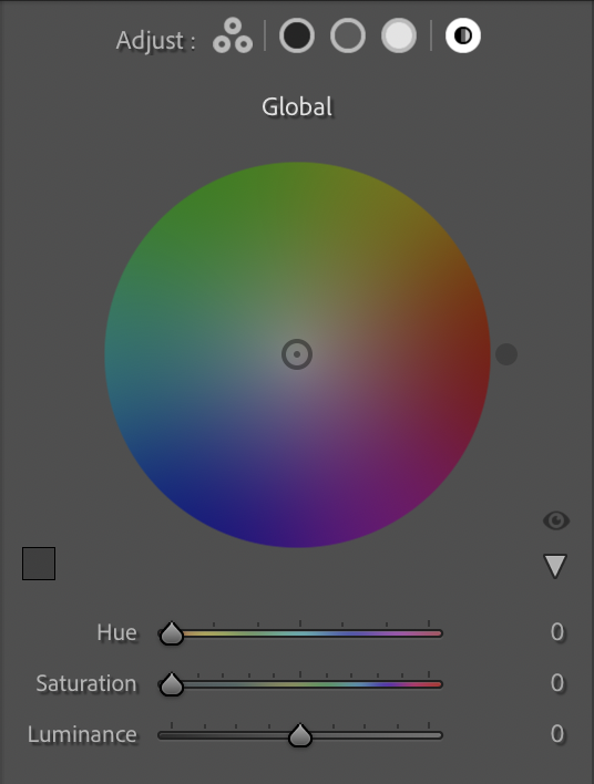
Under Global Adjustment, you have control over the overall Hue, Saturation, and Luminance of the image, but you cannot adjust Highlights, Shadows and Midtones separately.
However, like on the individual colour wheels, you can use the Hue Slider to add a specific colour to the image, and adjust the Saturation slider to increase or decrease the intensity of the colour added.
The luminance slider will affect the tonality of the overall Image. Increasing the Luminance slider towards the right will shift the tonality up, while moving it towards the left will push the tonality down.
About the author: Shreyas is an Adventure explorer, Nature and Wildlife Photographer. After photographing in different parts of India for more than a decade, he has focussed on what he is most passionate about: Digital Post Processing and Photography Mentoring. You can see more of his work and tutorials at shreyas-yadav.com.