
Creating without colour: A step-by-step black and white workflow
Black and white photography is often perceived as being a very pure form of photographic visual communication, in that we expect it to communicate a photojournalistic 'truth'.
This perception came about through it being used by newspapers to tell factual stories in the early days of mass visual communication, before colour was available. However, the only 'truth' is that black and white doesn't exist unless you are unfortunate enough to be colourblind!
That said, black and white photography (often also referred to as 'monochrome photography') has in recent years become the realm of the photographic artist, be it via street photography, portraiture, or landscapes, but just about all genres of photography can suit a black and white treatment.

The reduction process
I see and use black and white photography as being part of my ‘reduction’ process when making an image. By removing colour, we are effectively breaking the image down into the very basic elements of line, tone, and texture.
Line directs the eye around the image through shapes and patterns, while lighter tones project themselves forward as darker ones recede. Textures further break up the tone into smooth or rough which create a greater visual depth.
It's how we use these ingredients that make up a 'black and white' or 'monochrome' image, with the latter name being possibly a little more correct in its description. That said, an even better way to think of it might be as a 'grey tone image', as most of a black and white image is made up of grey tones that exist between the extremes of black and white.
My Black and White process
My black and white process always starts in camera while shooting a subject by selecting the 'Monochrome' picture style via my camera’s in-camera jpeg mode. I’ll also make a raw capture at the same time so I have the opportunity of also working the colour channels through the raw postproduction if I wish to, as I will explain later in this article.
Shooting monochrome in-camera allows me to see the image as a clean series of graphic shapes, lines, and textures, which simplifies how I compose. It's a little like doing a sketch of what is in front of me before filling in the details.
Added to this, I also increase the contrast through the in-camera monochrome picture style setting, as this increases the graphic nature of the image, making the lines and shapes appear stronger by spreading the tones out from each other. You can see what effect this is having by looking at the camera’s histogram while making these changes.
If I'm shooting a scene that has clouds and sky in it, I then also turn on the red filter in the monochrome camera setting which makes the blue sky darker. This will separate the tone of the clouds out from the background blue sky, creating a three-dimensional look to the clouds.
On many occasions the image I have made through the camera jpeg capture ends up being the one I end up using as it is often cleaner and stronger than the one that needs processing from raw.
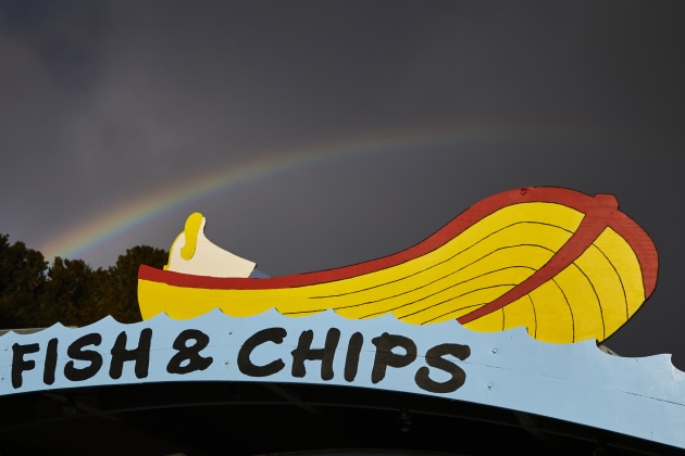
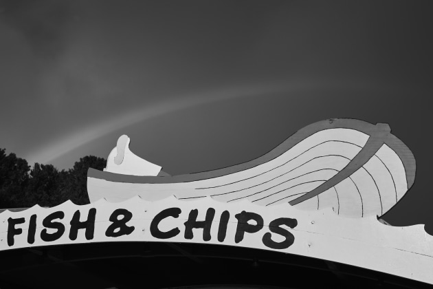
Fish and Chips on Stewart Island
Let’s look at a hands-on example. On a recent Stewart Island workshop, I made this photograph below of a rainbow over a fish and chips shop sign (this is pronounced ‘fush in chups’ in New Zealand) and then decided to see how it would look when converting the raw file into a jpeg by using the black and white converter in Capture One.
This process also works the same when converting raw to jpeg or tiff in Lightroom, or in Photoshop by using Image/Adjustments/Black and White and then changing the colour sliders.
When converting your file in this way, you can change the exposure of each independent colour channel without changing others. Doing this means you also have much more control over all the different tones in your image, even before you start playing with the contrast, levels, or curves.
To illustrate, I’ll show the change each channel makes when converting to black and white in this manner in quite an extreme fashion by increasing each channel 100%. I’ve done this in Capture One for this tutorial, but the same steps can also be found on the right panel in the Develop module in Lightroom under ‘Black and White Mix’ once you convert the image to black and white.
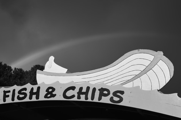
The starting point
Basic bw conversion

Increase the red channel
Increase the yellow channel

Increase the green channel
Increase the cyan channel
Increase the blue channel

Increase the magenta channel

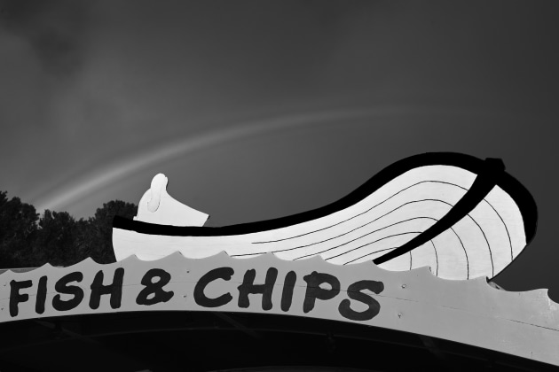
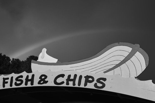
The actual adjustments
As you can see from the previous steps, increasing every channel 100% makes quite a drastic change that’s probably a bit too extreme in most cases. If you’re interested, the changes I made to get the final image above here were -100% on the Red channel, which makes the reds darker around the edge of the boat, +76% on the Yellow channel, making the yellow boat lighter, -11% on the Green channel, making the green in the rainbow darker, -11% on the Cyan channel, making the top of the waves a little darker, - 59% on the Blue channel, making the sky darker, and finally +100% on the Magenta channel, making the magenta in the rainbow lighter.
By making some channels darker and other channels lighter, I have increased the dynamic tonal range in the image, making it much more interesting. The key is to either increase or decrease the different colour channels for different results in the shadow and highlight parts of your image.