


Composition is the language of photography; it's how we communicate our ideas and feelings and control the way viewers' see and respond to our images. Alfonso Calero looks at ten compositional elements and how you can use them to create more powerful images.
01 DOMINANCE
In most successful images, one part of the design is more important than the rest. All other details are less important than the dominant part, but they also add to the composition. As a photographer you can make something stand out by its size, colour, brightness, texture, shape, position, or any combination of these elements. For instance, in a drawing of black shapes that are the same size, a smaller red shape would be dominant. Or a single triangle can be dominant over a group of triangles if it is away from the group. Your images will be stronger if there is a primary point of interest. One suggestion is to limit the number of important areas in a photo to three. Less is more. If your eye goes to more than three dominant points then it becomes confusing. Differing proportions within a composition can help establish visual weight and depth.
02 REPETITION
Repetition and rhythm are the repeating elements in an image, and can comprise shapes, colours, or lines. Repetition involves using similar things over and over again, while rhythm refers to using them in an order or pattern. Repetition and rhythm are just as important in photography as they are in music. In music, our ears pick out the rhythm. In art, our eyes pick out the patterns and follow them.
Spiral staircase inside the Maritime Museum in Santiago De Compostela, Spain. Repetition, line and shape lead the eye to the white circle of light in the top third of the image. Photo by Alfonso Calero.
03 LINE
Take a look at your favourite landscapes – chances are there will be some form of leading line that drags your eye into or around the photo.The type of lines you include also affect the mood of the image. A straight line will draw your eye quickly from one point to another, creating a sense of speed and dynamism. A curved line on the other hand tends to slow your eye down, creating a more peaceful feeling.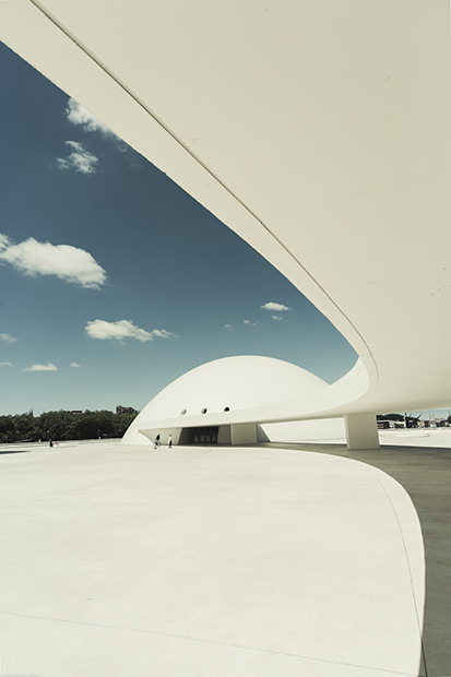
Lines are all important in the composition of this image of the Niemeyer Center in Aviles, Spain. The leading line in the top left draws our eye to the dominant disc-shaped building in the middle distance. Curved lines tend to slow things down, creating a more peaceful mood. Photo by Alfonso Calero.
04 SHAPE
When both ends of a line meet to surround space, the line forms a shape. Shape in images refers to elements that appear two-dimensional, such as squares, triangles, or circles. They can be made from curvy or straight lines. Shapes can also have bumpy or pointed edges as well. They can be things we do not recognise or they can be things we do recognise. It is easier to find shapes in man-made objects.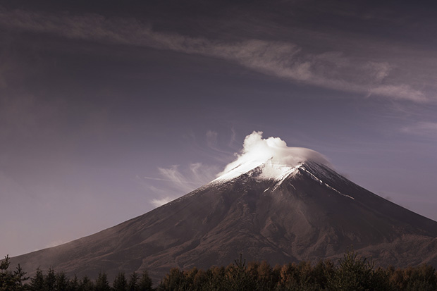
Mt. Fuji after sunrise has a cone shape with some texture highlighted in the dense clouds to draw the eye more precisely towards the peak.
05 FORM
Form is similar to shape, but it also describes the depth of an object. While shape refers to two-dimensions, form is three-dimensional. In photography, which is a two-dimensional medium revealing form can be difficult but it often comes down to the way the subject is illuminated and the how light and shadows describe the surface of the object.
06 TEXTURE
Texture refers to how the surface of something looks and feels. For example, the surface of a brick is hard and rough. Texture is simply the tactile quality of an object. Texture is an extremely good way to capture a viewer's interest, as it invokes more than simply their sense of sight but also their sense of touch. When taking photos where texture is the main element, it is best to light it from the side or from the back as this will bring out more texture. It is best to avoid harsh and direct light.
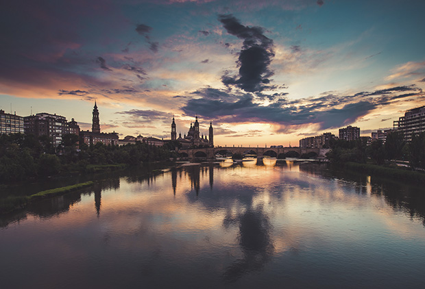
The Basilica in Zaragoza, Spain, at sunset.The ripples on the river give the image a textural quality while the left hand bank joins nicely along the bottom left corner to lead the eye to the basilica. The stone bridge as well draws the eye to the most dominant part of the shot. Photo by Alfonso Calero.
07 TONE
Tone is a critical tool in composition. Our eyes are naturally drawn to brighter tones and this has a strong influence on the way we see images. A bright highlight near the edge of an image will draw our eyes away from the centre of the picture. Conversely, a dark area at the periphery of the photo will tend to keep our eyes locked in the brighter central part of the photo. All things being equal, the brightest part of the photo will be dominant.
08 CONTRAST
Contrast refers to having different things in the same design. Think of it as the Yin & Yang of an image, the balance of the opposites. Long and short, black and white, light and dark, big and small – opposites are everywhere. Proportion is closely associated to contrast. It is the relationship in scale between one element and the other, or between a whole object and one of its parts.
09 UNITY
Unity, also known as harmony, pulls together all the elements of design into one pleasing whole. Each part of a design has to relate to other parts of the design. A single theme or idea may unify a design. When nothing distracts from the whole, you have unity. Unity is the relationship between the individual parts and the whole of a composition. 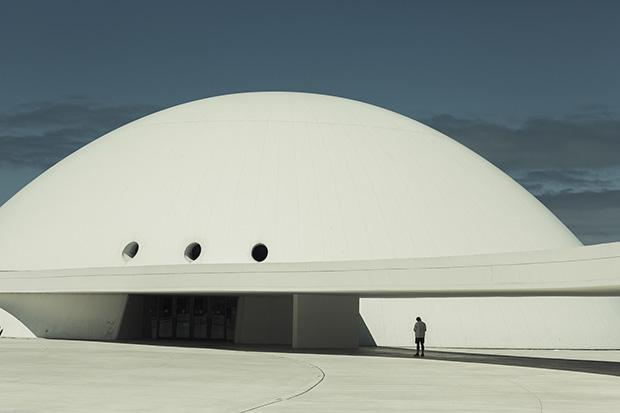
In this image what is the relationship between the man and the building, the sky and the ground? Do these elements work together as a unified whole? Photo by Alfonso Calero.
10 BALANCE
If a design or picture is unbalanced, you as the viewer will feel that something is wrong. Balance is an equilibrium that results from looking at an image and feeling that it is evenly 'weighted' from top to bottom and left to right. Balance usually comes in two forms – symmetrical and asymmetrical. Symmetrical balance occurs when the weights of a composition are evenly distributed around a central vertical or horizontal axis. Under normal circumstances it assumes identical forms on both sides. Asymmetrical balance occurs when the weight of a composition is not evenly distributed around a central axis, but there is still a pleasing balance of elements from top-to-bottom and left-to-right. The 'rule of thirds' is one example of a balanced yet asymmetrical compositional tool.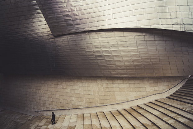
The Guggenheim Center in Bilbao, Spain, designed by Frank Gehry is massive. Using a person to add a sense of scale and placing them in the bottom left of the picture creates balance. Photo by Alfonso Calero.
Alfonso Calero graduated from the Sydney Institute of Technology with an Associate Diploma in Photography in 2001 and has been professionally photographing fine art, food, portraits, landscapes and travel subjects ever since. He is the owner of a travel education and tours company that delivers workshops every Saturday morning in Sydney, Melbourne, Brisbane, Adelaide and Fremantle. One on one or small group sessions are also available. He also takes groups to Japan, Philippines, Spain and Tasmania once a year for 5, 10 and 14-day photography workshops.