


There are all sorts of wonderful things that you can do to your images in post-production. Unfortunately there are a few terrible things you can do too. James Ostinga names his least favourite!
(If you have any pet image-editing peeves of your own, let us know in the comments box at the end of the article.)
01. OH HDR, YOU'VE GONE TOO FAR!
When was the last time you saw an HDR image you really liked? I'm talking about that super crunchy effect you see when seven different exposures of a scene are merged into one image where the colours are over saturated and every crack and wrinkle looks like it's been hand drawn with a 2B pencil. Most of us were seduced by HDR when it first appeared but it just looks dated now. And all too often HDR is used to disguise the fact that the photo was never very interesting to begin with. If your image doesn't have much going for it in terms of lighting, composition or subject, no amount of HDR – or any other effect for that matter – will save it. Rather than spending hours in front of the computer screen, grab your camera and get out there and take a better shot. We're all for subtle changes to bring back shadow and highlight details, but if the finished product ends up with that crunchy 'HDR' look, you need to start over!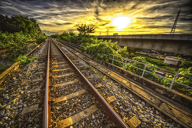
The ubiquitous HDR effect. Is it time to say goodbye to it once and for all?
02 WHAT'S WITH THE HALO?
Almost all images can do with some post-production sharpening but there's a fine line between sharp and 'what the hell did you do that for?' A light coloured halo around the edge of an object is a sure sign you've gone too far – you need to grab the sharpening slider and move it back the other way! It's important to know that you can't sharpen an out-of-focus picture. Software sharpening algorithms make the contrast between pixels more pronounced, but no amount of 'Unsharp Mask,' 'Smart Sharpen,' or 'Sharpen Edges' will make an out-of-focus photo look like it's in focus.
If you are sharpening an image in software, zoom in to 100% so you can see what affect your changes have on fine details in your picture. At 50% you may not be able to see that you've just doubled the noise in the image or added a fine halo around your mum's head! 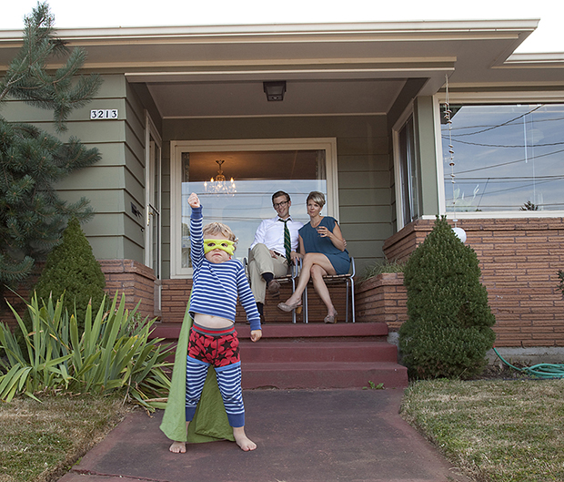
Sharpening requires a light touch. Halos around objects and lines (below) are a tell-tale sign that you have gone too far.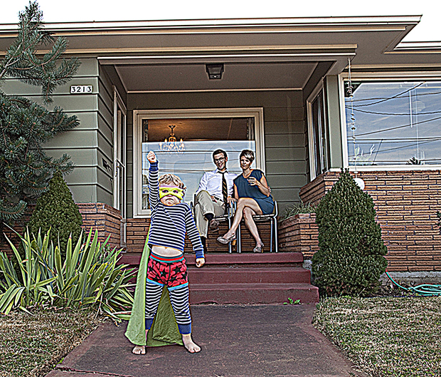
03 TOO MUCH VIGNETTE
Once upon a time, vignettes were mostly caused by light fall-off at the edges of low-quality lenses. These days, the vignettes you see in most images are deliberately added in post production. The advantage of a vignette is that it directs the eye into the image. The idea is that the eye is naturally drawn to the brightest areas of a scene, so by darkening the edges of an image you stop the eye from wandering out of the frame. That keeps the attention on the central part of the image, hopefully where the main points of interest are. Vignettes can work well but they can also spoil an image if they are applied clumsily. The rule of thumb is, if you can see the vignette it's probably too strong. Be subtle, tone it down!


A vignette has been applied to both these images, though much more subtly to the image on the left.
04 WHOOPS! ACCIDENTAL CLIPPING
You start editing your image, lightening something here, darkening something there, only to realise later that a big chunk of cloud has turned into a bright white detail-free streak at the top of the image! Or a shadow, rather than showing the fine texture of the ground on which it falls (as it once did!), has turned into a featureless black hole. Welcome to the frustrating world of clipping! So, what is it and how can you avoid it? Clipping occurs when pixels in an image reach their maximum or minimum brightness. Rather than seeing subtle shades of tone and colour, all that lovely detail is replaced by a solid block of black or white. Colours can also be clipped in any of the colour channels – red, green or blue for an RGB image – when the saturation range of a colour is exceeded.
The best way to avoid clipping is to keep an eye on the histogram as you edit. The histogram is a graph that indicates the makeup of tones in an image. The horizontal axis represents the range of tones from black on the left, moving through progressively lighter shades of grey, to white on the right. The height of the graph tells you if you have a lot of a particular tone in your image (those areas where the graph is high) or not much at all (where the graph is low). If the histogram is tallest on the left you know there are more dark tones in your image than light. If it is tallest in the middle, you have more midtones. If it is tallest on the right... well you get the idea!
Now, here's the important bit. If the histogram looks like it's pushed up against the right of the graph you can safely assume your shadows have clipped to black. Pushed up on the right and your highlights have blown out. Keep in mind that not all clipping is bad. If there is a bright light in your image or you're photographing something that is true black – say the night sky – you may be happy for some clipping to occur.
Most image-editing programs give you the option to turn on a clipping warning to alert you if an area of your image is clipped. In Lightroom the clipping warnings can be turned on and off by clicking the triangles in the top left (shadow warning) and top right (highlight warning) of the histogram. With the clipping warnings switched on, clipped pixels will be displayed as bright red to indicate blown highlights, or bright blue to indicate blocked shadows.
The histogram (top right) is pushed up against the left and right edges of the graph, showing clipping in the highlights and shadows. 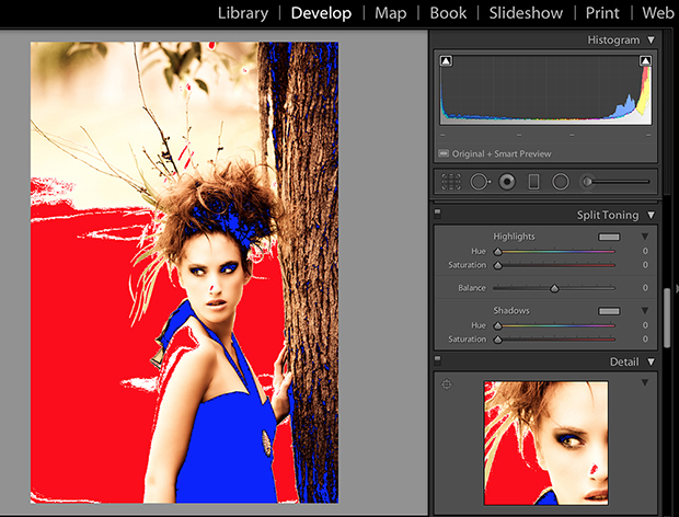
Clipping warnings in Lightroom show overexposed areas in red and underexposed areas in blue. This image has some problems – not least the branch that looks like it's growing out of the model's head!
05 CLICHES, CLICHES!
If you want people to take your photography seriously, avoid clichés. Here are a few popular image-editing clichés. Use them at your peril!
Selective colour: We've all seen this one, and most of us have done it. The image is converted to black-and-white, except for the model's deep blue eyes, the little girl's bright yellow gumboots, or the musician's golden saxophone. Blargh!
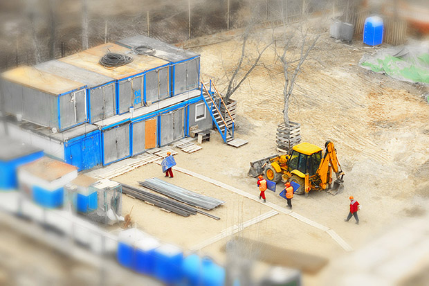
Miniature effect: I hate to include this one because I still quite like it! But the miniature effect has had its day! Unless you have a very specific reason for using it, like you're shooting a poster for a local production of Gulliver's Travels or The Land of the Giants, steer clear.
Painting effect: It doesn't look like a painting and it doesn't look like a photo. Usually it just looks cheesy.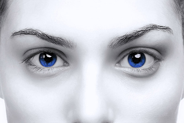
Selective colour (top) and miniature effect (above). Clichés or classic effects?